Today we are going to take a look at two common stock market charts that individually tell opposite stories but when combined give us an interesting insight into the overall market. The first chart is the S&P 500. As I’m sure you are aware the S&P 500 represents Standard and Poor’s top 500 largest companies.
S&P 500
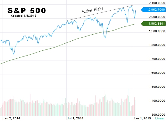
A quick look at this chart tells us two things:
The first thing we see is that the index is above the green 200 day moving average indicating that the market is still in a long term uptrend. The market is at 2,062.70 while the 200 day moving average is only 1,962.9341.
The second obvious feature is that the S&P 500 continues to make higher highs also indicating a bullish outlook. On closer examination we might note that the index only briefly crossed below the 200 day moving average once in the last year.
NYSE
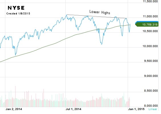 This chart represents the entire New York Stock Exchange sometimes known as the “Big Board“. When we look at this chart we see something entirely different. First we see the index has just crossed back above it’s 200 day moving average. Looking to the right side, we can see that the moving average is 10,768.618 but the index is currently so close we can’t read that it says 10,800.54. So the index is barely above its moving average.
Next we see that the index is making “lower highs” indicating weakness. And finally we might notice that it has crossed the 200 day moving average 3 times in the last year… indicating that it is much closer to the average than the S&P 500 is and also indicating weakness.
So the S&P looks strong while the NYSE looks considerably weaker.
So what’s the difference?
At first we might think that there isn’t much difference between the two indices. After all both represent broad markets and there is actually considerable overlap of the same companies in both. So what is the difference? First of all the NYSE is comprised of 2,800 companies, ranging from blue chips to new high-growth companies to Foreign Shares. So there are both strong and weak companies included and it is very broad based.
Both indexes use a “market capitalization weighting”, meaning that the companies that have the highest valuation when you multiply share price by number of shares get more weight in the index than the smaller companies. But with 2,800 companies the weaker ones will still pull the top 500 down.
What does it mean?
When an up-cycle begins, often the smaller capitalized stocks will outperform the larger companies as growth takes off. But as the cycle matures you will often find that the small companies are stagnating and investors are shifting to safer “large cap” stocks. With the overall NYSE performing considerably worse than the S&P 500 we can see that the market is maturing and getting closer to the next correction.
[…] Market Trends Diverging […]