The Fundamentals are Reflected in the Charts
The market’s pricing mechanism, is based on the aggregate opinion of every investor around the globe and thus allows us to compare economic confidence in late 2007 to the present day. A more direct way to say it is “charts enable us to monitor the conviction that stocks will push higher relative to the conviction that stocks will fall”. The aggregate investor opinion is based on everyone’s interpretation of the economy, earnings, Fed policy, etc. This helps us understand the concept that the fundamentals are reflected in the charts.
2007 vs. 2014
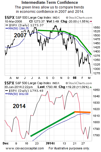
The S&P 500, or price, is like an economic poll where investors vote with their wallets. The blue line in the charts below is the 50-day moving average, which is used to filter out day-to-day volatility, allowing us to focus on the intermediate-term trend of investor confidence. It is easy to see the present state of economic/market confidence is much healthier than it was in 2007 (compare the first chart to the second). However, the 2014 flat 50-day (see orange line) speaks to a relatively evenly matched battle between bullish economic conviction and bearish economic conviction.

Indecisiveness Says ‘Pay Closer Attention’
Markets eventually migrate one way or another from an indecisive state. Said another way: 50-day moving averages do not stay flat forever. Therefore, it is prudent to have contingency plans in place for a big move in stocks (up or down).
GDP Gives Buyers A Reason To Step In
Bear markets are typically associated with economic contractions. Thursday’s GDP numbers did not hint at an imminent recession. Consequently, buyers stepped up to the plate. From Reuters:
Gross domestic product grew at a 3.2 percent annual rate, the Commerce Department said on Thursday, in line with economists’ expectations. Consumer spending rose at a 3.3 percent rate, the strongest since the fourth quarter of 2010. Consumer spending, which accounts for more than two-thirds of U.S. economic activity, advanced at a 2 percent pace in the third quarter.
Investment Implications – Flexible Portfolio
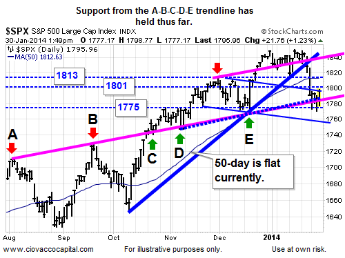
Since our market model allocates based on observable evidence, it should not be surprising that an indecisive market produces a mix of stocks (SPY), bonds (TLT), and cash. The S&P 500 is still loitering near the A-B-C-D-E trendline below that has acted as both resistance (red arrows) and support (green arrows).
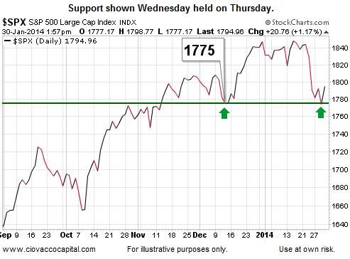
After Wednesday’s sell-off in stocks, we noted the bulls had hope near 1775 on the S&P 500. Below is an updated version of the chart shown Wednesday. Holding above 1775 also keeps the head-and-shoulders pattern covered Tuesday in play.

This chart shows an example of the observable changes we need to see before redeploying cash back into the equity side of the portfolio. Our current allocation allows us to migrate in either direction based on how the market’s profile evolves. We still own technology (QQQ) and may consider adding to that stake if things improve. We also have mid-caps (MDY), Germany (EWG), homebuilders (ITB), transports (IYT), health care (XLV), and broad U.S. exposure (VTI) on the list of possible buys. We will let the market’s pricing mechanism be our guide.
This article originally appeared here and has been reprinted by permission.
Copyright © 2010 Ciovacco Capital Management, LLC. All Rights Reserved. Chris Ciovacco is the Chief Investment Officer for Ciovacco Capital Management, LLC (CCM).
Speak Your Mind