By looking at previous bear markets we can get an idea about how advance/decline volume behaves in bear markets. ~Tim McMahon, editor
The Message from Up/Down Volume
The Dot-Com Bust Bear Market
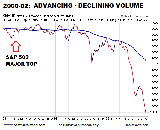
When the S&P 500 reached a bull/bear tipping point in March 2000, NYSE Advancing – Declining Volume was already waving yellow flags. As shown in the chart below, $NYUD was hugging its 50-week moving average and the 50-week was rolling over in a bearish manner.
2008 Financial Crisis Bear Market
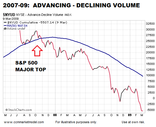
A similar and ominous rollover look occurred in $NYUD’s 50-week moving average soon after the S&P 500 peaked in October 2007. Notice how $NYUD tested the 50-week and then failed by dropping below the 50-week.
How Does the Same Chart Look Today?
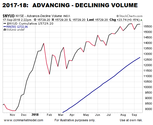
The 2017-18 version of the same breadth indicator looks nothing like the 2000 peak nor the 2007 peak. $NYUD remains well above a positive-sloping 50-week moving average and is near new highs, indicating a much healthier market versus 2000 and 2007.
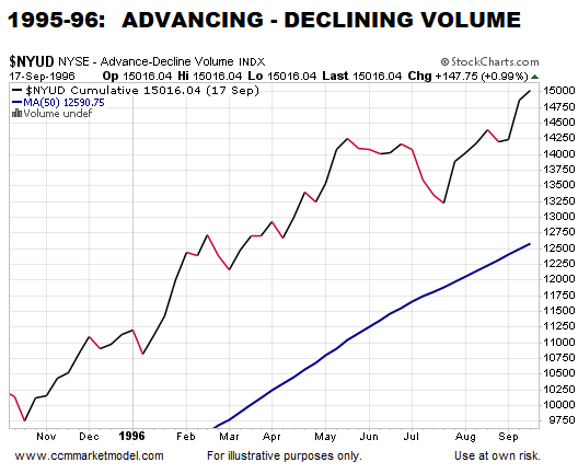
How Does 2018 Compare to a Bullish Period?
Why is it Important to Have an Exit Strategy?
This week’s stock market video covers the present-day market in the context of bear market migration strategies. Now is the time to water test your portfolio/asset allocation strategy.
Up/Down Volume is Just One Piece of Evidence
The charts above align with numerous data points that continue to favor long-term bullish outcomes for the markets and economy. If the data begins to shift in a meaningful way, we must be flexible enough to reassess the odds of good things happening relative to the odds of bad things happening.
You might also like:
- This Doesn’t Happen in Bear Markets
- Is Gold on the Verge of a Bottom?
- Moving Averages Help You Define Trend – Here’s How
- Charts Say Stocks Could Rise For 10-15 Years
This article by Chris Ciovacco originally appeared here and has been reprinted by permission.


Speak Your Mind