Make It Stop
Nobody likes minus signs and red screens, which create a feeling of being out of control. While hitting a sell button can make us feel like we are back in control, it often leads to overtrading and disappointing returns.
Recent Examples
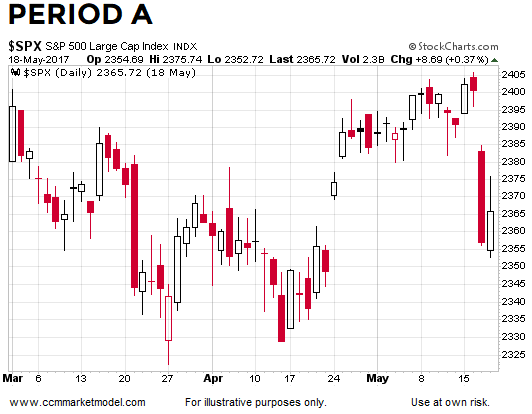
The chart of the S&P 500 below shows a period with several red days that featured strong selling pressure. Red screens and minus signs were unnerving during period A, just as they have been unnerving over the past week.
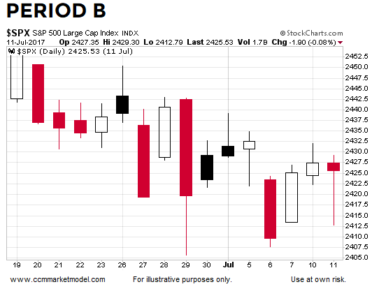
Period B below most likely featured numerous examples of overtrading and swigs of Pepto-Bismol.
What Happened Next?
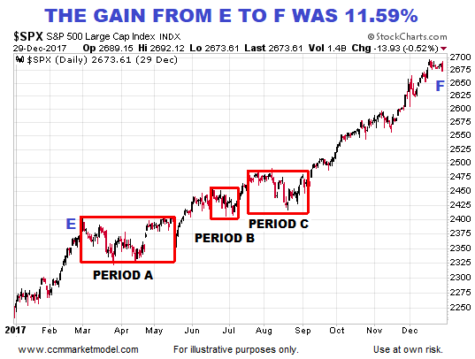
Despite numerous scary red days, between point E and point F the S&P 500 gained 11.59%.
Hard Data Helps With Odds
If we add the S&P 500’s 200-day moving average to the equation, it becomes more apparent that periods A, B, and C all occurred within the context of an existing uptrend. Since uptrends make higher highs by definition, the slope of the 200-day told us to remain open to good things happening once the period of volatility ended.
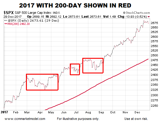
There is nothing magical about the slope of the 200-day moving average; it is shown as a proxy for the weight of the evidence that existed in calendar year 2017. No indicator, including the 200-day, should be used in isolation to make any decisions related to the health of the financial markets.
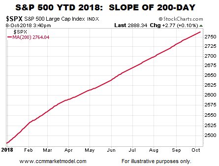
How Does the 200-Day Look Today?
Given what we know today, the weight of the evidence continues to favor the “we are still in a bull market” side of the ledger relative to the “the final high has been made” side.
Broader Evidence Covered Here
This week’s video revisits numerous forms of hard evidence that was used to make the bullish case over the past 2+ years. Is the evidence starting to deteriorate in a meaningful way? You can decide after viewing charts of the S&P 500, NASDAQ, Dow, small caps, global stocks, and bonds.
Day by Day
If the weight of the evidence shifts in the coming days, weeks, and months, we must remain flexible enough to reassess the odds of good things happening relative to the odds of bad things happening.
This article by Chris Ciovacco of Ciovacco Capital Management originally appeared here and has been reprinted by permission.
Speak Your Mind