In the following article by Chris Ciovacco of Ciovacco Capital Management he uses our Misery Index chart to show how markets often rebound from miserable circumstances. And no I didn’t influence him to use our chart 🙂 . ~Tim McMahon, editor
This article by Chris Ciovacco of Ciovacco Capital Management originally appeared here and has been reprinted by permission.
Skepticism Common Before Multiple-Year Moves
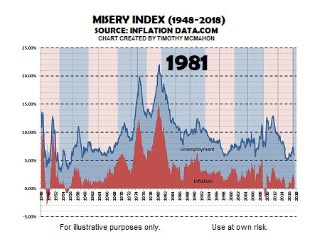
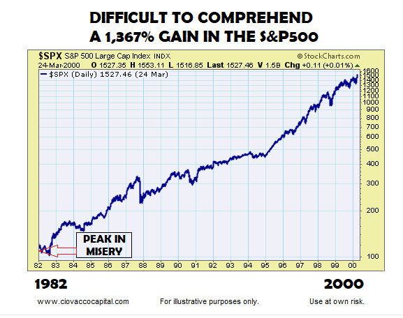
If someone told us in 1981 the S&P 500 would post a 1,367% gain over the next 18 years, it would have been very difficult to believe after seeing an all-time high in the misery index in June 1980. From miseryindex.us:
“The misery index is simply the unemployment rate added to the inflation rate. It is assumed that both a higher rate of unemployment and a worsening of inflation both create economic and social costs for a country. A combination of rising inflation and more people out of work implies a deterioration in economic performance and a rise in the misery index.”
Is 2016-17 significantly different from 1981-1982? Yes, just as 1994 was different in many ways from 1982. However, there are some similarities between the early 1980s and 2016-2017, as outlined in detail on January 19. The topic of valuations is addressed in How Helpful Have Valuations Been Over The Past 30 Years?
Tech To Rise 600%? No Way
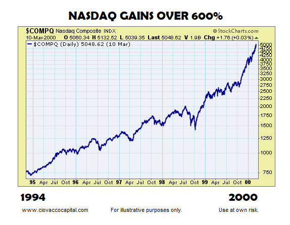
If someone told us in 1994 the NASDAQ would rise over 600% in the next seven years, it would have been extremely difficult to believe. In fact, given all periods in history have numerous things to be concerned about (including 1994 and 2017), human beings will always have trouble comprehending the possibility of long-term gains in the financial markets that fall into the 100% to 1,000% range. Similarities between 2016-17 and 1994-95 were outlined in detail in December 2016.
Skepticism Remains High In 2017
If you monitor stock market charts with an open mind, especially long-term charts, the August 14, 2017 Bloomberg headline below is a head scratcher, especially the “recession looms” portion. The headline writer’s choice of pessimistic words captures the mood of many in 2017 despite an overwhelming amount of long-term bullish evidence (see links at bottom of post).

Market Not Hinting At Imminent Recession
Rather than looking like a recession and bear market are right around the corner, the U.S. stock market appears to be setting up for a multiple-year bullish move, which is understandably very hard for many to believe, just as it was in 1981, 1994, or March 2009.
The charts below were first presented as long-term bullish evidence on December 13, 2016. The first chart below shows the S&P 500 as of Monday, August 14, 2017; notice how concerns about North Korea, which were also present in 1994-1995, have not significantly altered the present day long-term trends.
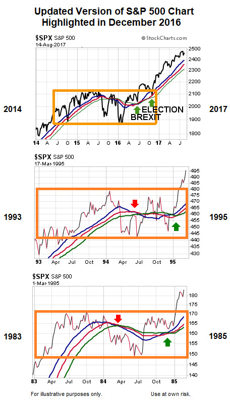
Does 2017 Look Like The Early Stages Of A New Bear Market?
This week’s video was recorded on August 11, after one of the worst trading weeks of the year for stocks. The video highlights the market’s present day profile in detail, including historical comparisons to past bearish turns and periods of tension between the U.S. and North Korea.


Facts: The Basis For Long-Term Optimism
Even in the face of skepticism from the media and investors, the stock market’s profile has improved significantly over the past year. The links below show numerous examples of hard evidence that has come to light since August 1, 2016 that told us, and continues to tell us, to keep an open mind about all stock market outcomes, including much better than expected outcomes:
- Consensus View On Stocks Is Not Being Confirmed By Price
- The Market Is Telling Us Something Has Changed
- How Does 2017 Compare To Stock Market Peaks In 2000 And 2007?
- Signal Has Only Occurred 10 Times In The Past 35 Years
- History Tells Us Polls And Anticipated Market Reactions Can Be Way, Way Off
- S&P 500 Index: Rare Bollinger Band Width Worth Monitoring
- Reliable Contrarian Indicator Says Stocks Could Rise 25%
- Numerous Long-Term Signals Support Bullish Case For Stocks
- These Charts (1982-2016) Paint A Bullish Picture
- Stocks: 1987 Crash Or 1994 Buying Opportunity?
- Merrill Lynch Sees 1950s-Style Secular Bull Market
- What History Tells Us About Low VIX Readings & Stock Market Risk
- Secular Stock Market Signals Have Occurred Only One Other Time Since 1928
- How Helpful Have Valuations And Earnings Been Over The Past 30 Years?
- How Does 2017 Compare To Historical Bubbles?
- How Was The Collective Mood As Stocks Started A 19-Year Secular Bull Run In 1982?
- The Mother Of All Stock Market Signals
- Is Market Breadth Waving Bearish Flags?
- How Concerning Is An “Overbought” Reading On Weekly RSI?
- Rare Signal Says Stock Rally Is The Real Deal
- S&P 500: Rare Bollinger Band Signal Clears Important Hurdle
- Stocks Post 35-Year Breakout
- Why Odds Still Favor New Record Highs In Stocks
- How Concerning Is The S&P 500’s Pullback?
- This indicator had a divergence in both 2000 and 2007; a divergence is also present in 2017
- Are Defensive Assets Waving Red Flags For Stocks?
- Early Stages Of A Life-Changing Rally?
- Stocks: The Big Picture
- Numerous Charts Support Long-Term Bullish Case (Top vs. Bottom)
- Sector: Be Open To Enormous Upside In Stocks
- Low Volatility And Stock Market Risk
- How Concerning Are Predictions Of A Stock Market Crash?
- How Does 2017 Compare To Stock Market Peaks In 2000 And 2007?
- Are Stocks In A Bubble That Is About To Burst?
- Investing: The Incredible Power Of Staying In The Now
- Is The NASDAQ Showing 2007-Like Cracks?
- Is Volume/Breadth Aligned With Bullish Case?
- Stocks: The Forest And The Trees
- These Charts Paint A Long-Term Bullish Picture
- Is The Market Reacting To Earnings Or Just Charts?
Long-Term Means Long-Term
Even if stocks surprise on the upside in the next 5-15 years:
- Normal volatility, pullbacks, and harsh corrections will always be part of any bullish equation.
- Unfortunately, short-term fear and narrow framing will cause many investors to miss what could turn out to be a generational opportunity in the stock market.
If your response is “no way” to all of the above, keep in mind “no way” was a seemingly logical reaction in 1982 and 1994 as well, and yet, stocks exceeded even the most bullish expectations.
You might also like:
- What is the Misery Index?
- What Does “Paddle-boarding” Have to do with Speculating?
- Understanding the Relative Strength Index (RSI)
- Top 3 Technical Tools Part 1: Japanese Candlesticks
- Taking the Long View of the Market
Speak Your Mind