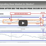
Fifteen times in Forty-Two years is about once every 8½ years. That makes it a relatively rare occurrence. In today’s video, Chris Ciovacco of Ciovacco Capital Management looks at the recent MACD cross. The first MACD cross which occurred in September 2018 reveals the beginning of a countertrend movement in the prevailing uptrend. But when the “black” MACD line crossed below the zero line in November we get what looks like a confirmation of the switch from a countertrend movement to a full downtrend movement.
But on March 8th 2019, we see the “black” MACD line crossing back above the zero line. Thus we see the relatively rare signal as follows, “MACD crosses below the centerline on a weekly closing basis and stays below for at least 3.5 to 4 months, and then closes back above the zero line”… this makes it look more like a new uptrend rather than a countertrend rally.
NASDAQ Signal Has Only Occurred 15 Times In Last 42 Years
Reversals And Counter-trend Moves Typically Take Time To Develop
Since investor psychology tends to be similar after a sharp plunge in the stock market, subsequent bottoms and/or countertrend rallies often share similar characteristics… making determining which is which more difficult.
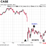
1987 vs. 2018
Typically, investors see October as a tough month for the Stock market with “The Panic of 1907 (October 1907)”, Black Tuesday, Thursday and Monday (October 1929), and Black Monday (October 1987). But according to Investopedia September is actually just as bad with Black Friday (September 1869), Black Wednesday i.e. September 16, 1992, when the pound sterling crashed forcing Britain to withdraw from the European Exchange Rate Mechanism (ERM). September 2001 and 2008 each had single day point declines in the Dow that were bigger than Black Monday October 1987. A 2014 Business insider article stated that “the Dow October average over this timeframe is a modest 0.20%. There have been 64 monthly gains and 49 monthly losses. That’s calculates as a gain about 57% of the time.” The following article by Chris Ciovacco of Ciovacco Capital Management compares market action in October 1987 to October 2018.
Latest Economic Data Doesn’t Align with Yield Curve Fears
According to numerous articles, a flattening yield curve nearing the zero boundary is a major red flag for stocks and the economy. But…
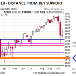
The Stock Market Big Picture

One of the keys to making more prudent and rational decisions is to look at more than just the red screen in front of us, which represents only one timeframe (the shortest). It can also be helpful to think in extremes.
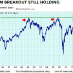
Recent Breakouts Say a Lot about Markets and Economy
When investors are confident about future economic outcomes, they tend to prefer growth-oriented XLY (consumer discretionary) over defensive-oriented XLP (consumer staples). The 2002-2009 chart below shows the XLY:XLP ratio consolidated for several years before breaking down in October 2007.
Tariffs May Not Slow Profit Momentum
BIG IMPACT OR SMALL IMPACT? U.S. Treasury Secretary Steven Mnuchin indicated Sunday the U.S. is hopeful to strike a deal with China, which means the tariffs would never go into effect. However, if a deal cannot be reached, how significant are the tariffs relative to the big picture? From CNBC: Jeremy Zirin, head of investment strategy […]
Skeptical Bias Toward Stocks Aligns With Bullish Charts
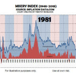
If someone told us in 1981 the S&P 500 would post a 1,367% gain over the next 18 years, it would have been very difficult to believe after seeing an all-time high in the misery index in June 1980. From miseryindex.us:
“The misery index is simply the unemployment rate added to the inflation rate. It is assumed that both a higher rate of unemployment and a worsening of inflation both create economic and social costs for a country. A combination of rising inflation and more people out of work implies a deterioration in economic performance and a rise in the misery index.”
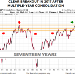
Taking the Long View of the Market
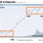
In the following article Chris Ciovacco of Ciovacco Capital Management takes a look at the big picture of the stock market. It is very possible the stock market’s behavior between 2016 and 2034 will be significantly different from its behavior between 1997 and 2015. Therefore, our approach to the markets needs to be flexible enough to handle the possibility of much stronger and sustained trends than what we have seen in our investment lifetimes.
How Concerning Is The S&P 500’s Pullback?

This week’s video reviews the impact of the recent pullback on the longer-term outlook. The video also covers the emotional impact of portfolio draw-downs.