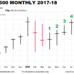
When the stock market peaked in late January, many hypothesized it was the beginning of a long-term bear market. As shown in the S&P 500 monthly chart below, stocks posted red months in February and March, and went on to post gains for five consecutive months. The green months in April, May, June, July, and August mean the S&P 500 posted gains in 11 of the last 13 months.
Charts Say Stocks Could Rise For 10-15 Years
August 1, 2018 by Leave a Comment
With busy lives and a constant barrage of new information, many investors have a somewhat limited view of history from a financial markets/economic/political perspective. Albert Einstein reminds us of the benefits of taking a step back to review the bigger picture in a longer-term historical context:
“Somebody who only reads newspapers and at best books of contemporary authors looks to me like an extremely nearsighted person who scorns eyeglasses. He is completely dependent on the prejudices and fashions of his times, since he never gets to see or hear anything else.” Albert Einstein
Latest Economic Data Doesn’t Align with Yield Curve Fears
July 5, 2018 by Leave a Comment
According to numerous articles, a flattening yield curve nearing the zero boundary is a major red flag for stocks and the economy. But…
The Stock Market Big Picture
June 20, 2018 by Leave a Comment

One of the keys to making more prudent and rational decisions is to look at more than just the red screen in front of us, which represents only one timeframe (the shortest). It can also be helpful to think in extremes.
Using Longer Timeframes To Combat Volatility Fatigue
June 14, 2018 by Leave a Comment
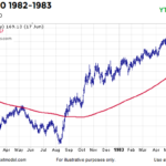
A December 2016 video covered an extremely rare signal that occurred in 1982 and 2016. Since then, markets have reacted in a bullish manner, meaning we have no reason to doubt the long-term signal that occurred at the end of 2016. Therefore, it may be helpful to understand the stock market’s volatility profile between 1983 and 1985.
Recent Breakouts Say a Lot about Markets and Economy
May 2, 2018 by Leave a Comment
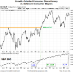
When investors are confident about future economic outcomes, they tend to prefer growth-oriented XLY (consumer discretionary) over defensive-oriented XLP (consumer staples). The 2002-2009 chart below shows the XLY:XLP ratio consolidated for several years before breaking down in October 2007.
Tariffs May Not Slow Profit Momentum
March 28, 2018 by 2 Comments
BIG IMPACT OR SMALL IMPACT? U.S. Treasury Secretary Steven Mnuchin indicated Sunday the U.S. is hopeful to strike a deal with China, which means the tariffs would never go into effect. However, if a deal cannot be reached, how significant are the tariffs relative to the big picture? From CNBC: Jeremy Zirin, head of investment strategy […]
Stocks Can’t Keep Going Up Forever… Or Can They?
January 22, 2018 by Leave a Comment
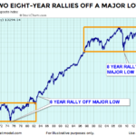
Wall Street traders love to live by “truisms”, “clichés”, and/or “maxims”. One such refrain that we constantly hear is that “Stocks can’t keep going up forever” but then there is “the trend is your friend” and “the market climbs a wall of worry”. When you put them all together what do you get? Should you worry about a top or should you be happy that others are still worried… because that means the top isn’t here yet? After-all, the market continues to climb until everyone has bought. If there are still bears out there, they are still potential buyers. On our NYSE Rate of Change page we published a couple of charts by “Chart of the Day” which showed the average length of rallies before a 15% and 20% decline. But if you take a longer term view, even a 15-20% correction could be inside a longer term bull market.
In today’s post, Chris Ciovacco of Ciovacco Capital Management takes a look at the historical precedent for the current market.
New Long-Term Equity Breakout
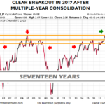
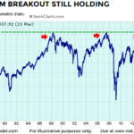
January 10, 2018 by Leave a Comment
On Tuesday, CME and CBOE TV financial commentator Alan Knuckman said on Fox Business, “Trump’s historic tax cuts will boost most American corporate earnings lines by at least 20% in 2018 — sending stocks soaring still from their current levels.” He is predicting that the Dow will reach 30,000. He said, “The Dow Jones Industrial Index is now within 21% of the 30,000 milestone which is very achievable after returning 25% in 2017.”
But after being up so much in 2017 isn’t it “overvalued”? You might ask. One reason for optimism is that even after being up so much earnings are up about the same amount. So the P/E ratio is roughly where it was a year ago, i.e. slightly above 21%. That is just slightly above the average level and well below peak levels. With corporate earnings up another 20% due to tax reform this year, prices could go up that much as well and the market still wouldn’t be overvalued.
Skeptical Bias Toward Stocks Aligns With Bullish Charts
August 31, 2017 by Leave a Comment
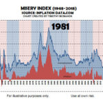
If someone told us in 1981 the S&P 500 would post a 1,367% gain over the next 18 years, it would have been very difficult to believe after seeing an all-time high in the misery index in June 1980. From miseryindex.us:
“The misery index is simply the unemployment rate added to the inflation rate. It is assumed that both a higher rate of unemployment and a worsening of inflation both create economic and social costs for a country. A combination of rising inflation and more people out of work implies a deterioration in economic performance and a rise in the misery index.”